App and Data Management
This section describes the App and Data Management Tab in detail.
The App and Data Management Tab
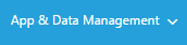
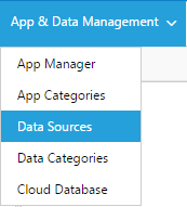
When you hover over the ‘App and Data Management’ tab, you will open the ‘App and Data Management’ dropdown:
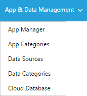
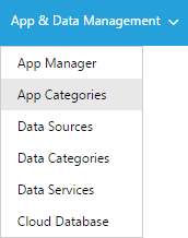
The App and Data Management tab allows you to manage all of your Apps: App Manager, App Categories, as well as Data Sources, Data Categories, Data Services and Cloud Databases.
App Manager
The ‘App Manager’ module is used to manage and build your Apps. Under
the App Manager  , click on the
  button to create
content for your Apps and assign Business Rules to various parts of your
Apps.
button to create
content for your Apps and assign Business Rules to various parts of your
Apps.
App Search
The App Search feature allows you to search for Apps based on search criteria. You may select these criteria in the ‘App Search’ dialog box:

- Type in an App name to search for, or leave blank to show all Apps. (Leaving all fields blank and then going to Step 5 will display ALL Apps in your Space)
- Choose a date range to see Apps made in a specific time period
- If applicable, choose a location to filter Apps
- If applicable, choose a category *and* a subcategory to filter Apps
- Click
 to show the results of the search
The submissions that satisfy your search criteria will appear in a table sorted by most recent updated date.
Managing Apps
In the App Manager module, you can create a new App, delete Apps, or import/export Apps.
App Builder Toolbar
This is the App Builder Toolbar:
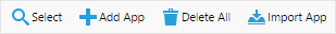
Click to show a list of Apps based on the search criteria
given in the ‘App Search dialog’
Click  to create a new App. This is discussed in detail in
section 4.5
to create a new App. This is discussed in detail in
section 4.5
Click  to delete all of the App that appear in the list.
NOTE: Once you delete an App, you cannot get it back, and ALL of its submissions, files, and any other data associated with it will be also be deleted. It is advisable to export any Apps/Submissions that you may need later if you choose this option.
Click  to import an App from an XML file that has previously
been exported.
to import an App from an XML file that has previously
been exported.
The Apps Table
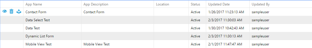
The Apps table gives you an overview of your accessible Apps. You can perform actions on individual Apps on the Apps Table.
Click  to edit the App. This is discussed in detail in section
4.5.
to edit the App. This is discussed in detail in section
4.5.
Click  to delete the App. NOTE: Once you delete an App,
you cannot get it back, and ALL of its submissions, files, and any other
data associated with it will be also be deleted. It is advisable to
export any Apps/Submissions that you may need later if you choose this
option.
to delete the App. NOTE: Once you delete an App,
you cannot get it back, and ALL of its submissions, files, and any other
data associated with it will be also be deleted. It is advisable to
export any Apps/Submissions that you may need later if you choose this
option.
Click  to download and export the App to an XML file. The App
can later be imported back into ReachLite.
to download and export the App to an XML file. The App
can later be imported back into ReachLite.
Creating/Editing an App
You can enter the App Editor by either creating a New App, or editing an existing one.
Click in the App Builder toolbar to create a new App, or
click beside an App name in the table to open the App Editor:
Navigating the App Editor
This section explains how to navigate the App Editor. Click on
beside the ‘App Name’ and the App editor will appear.
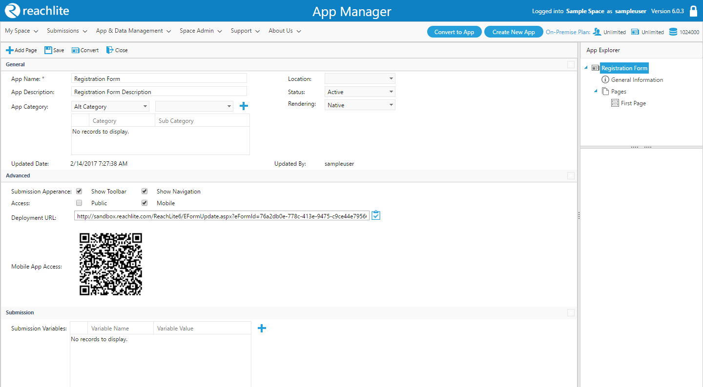
Tree View
On the right, you will see the App tree dialog, which allows you to access different areas of your App.
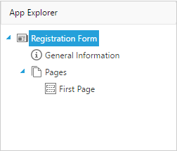
You can click on ‘Pages’ to view and manage Pages for this App. You can click on any of the Pages under ‘Pages’ heading to view and edit properties of that Page.
- The first item in the tree view displays the name of the App.
- General Information - Displays the General Information screen of the App, allowing you to edit various properties of the App.
- Page – Displays the list of all Pages of the App.
At the top of the editor there is a toolbar:
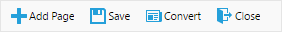
Click  to add a new Page to the App.
Click  to save all changes that you have made in the editor.
Click  to upload an image or PDF file to be converted into an
App. Clicking the ‘Convert’ button will open up the ‘App Converter’
menu:
to upload an image or PDF file to be converted into an
App. Clicking the ‘Convert’ button will open up the ‘App Converter’
menu:
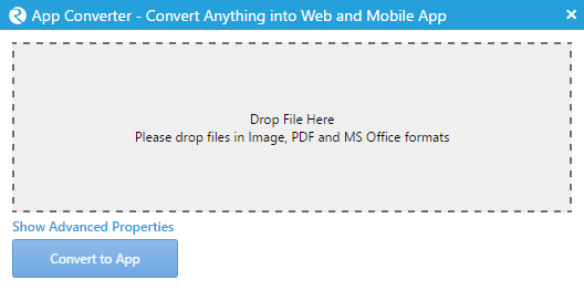
Upload a file by dragging any convertible document into the designated area (pictured above) and customize your settings before finishing the converting process (See App Converter for more information).
Click  to close the App Editor.
Under the toolbar is a dynamic dialog that switches based on what you are editing. The bottom left is also a dynamic window which allows for further editing of other details.
Creating a New App
To create a new App, in the main App Manager window (not in the editor),
click on . You will see the following window:
You should enter the fields ‘App Name’ and ‘App Description’ as soon as you make your new App as they are required before any Pages can be added. They can both be the same if desired. Refer to the following section ‘Editing App General Information’ for more on filling out the fields in this view.
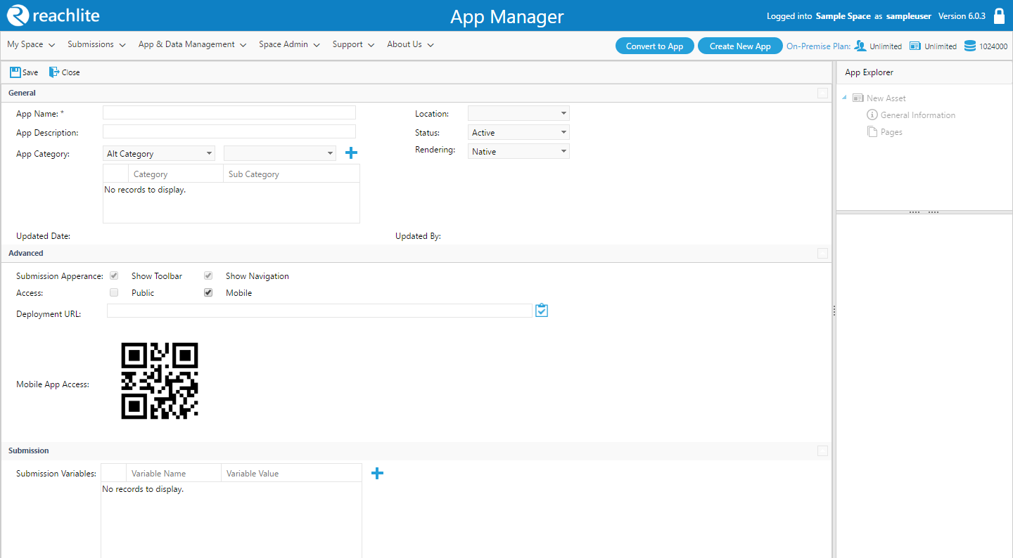
Editing App General Information
Click on ‘General Information’ in the Tree View to open up the General Information dialog box:
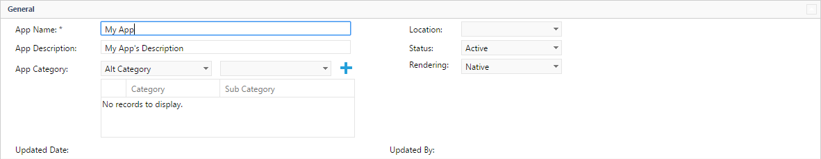
You can edit various general properties of the App here. If you make a
new App, start by filling out this information first. Make sure to
click before leaving the General Information page to save
your input.
The following properties are available:
- App Name (Required): The name of the App.
- App Description (Required): A description of the App.
- Location: The location to which this App is assigned to. (A physical location such as the name of institution).
- App Category: The Categories and Subcategories to which this App is assigned to.
- Status: Select ‘Active’ to allow new submissions to be made to this App and to allow collaboration with other users on this App. Setting to ‘Inactive’ takes away these abilities.
- Updated By/Date: When and by whom the App was last updated.
To add a category/subcategory pairing, select them from the dropdown
menus and click  to add them to the list. You can assign an
App to multiple categories.
to add them to the list. You can assign an
App to multiple categories.
Editing App Advanced Options
The App’s ‘Advanced Options’ are located below the General Information dialog box:
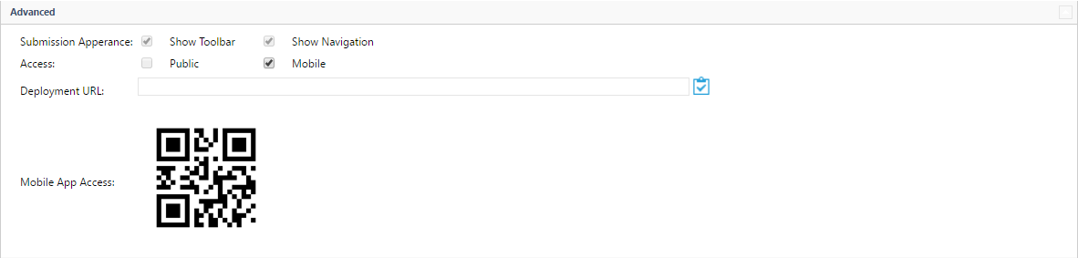
- Submission Appearance: The App appearance checkboxes allow control over how the App is displayed outside of the ReachLite environment (such as using the App Deployment URL). Check or uncheck the boxes to either show or hide the toolbar, navigation bar.
- Public Access Level: If public access is allowed, then the App can be accessed outside of the user session of the user who made the App on ReachLite. For example, if the user does not allow public access, then if a different browser is open or another computer is used to access the App by the Deployment URL, the App will not be visible and the URL will redirect to the ReachLite login page. If Public Access is allowed, then the URL can always be accessed.
- Mobile Access Level: If mobile access is allowed, then the App can be accessed using various mobile devices like tablets and smartphones (Apple and Android based)
- Deployment URL: This is the URL which directs users to the App outside of ReachLite.
Editing App Submission Variables
Submission variables are user defined variables which extend to the entire scope of the App. In other words, Submission variables are global variables in the sense that they are shared between Pages in a single App or Submission.
The App’s ‘Submission’ dialog box allows for the declaration of such Submission variables. Submission variables that are declared here may also be used in conjunction with the Data Mapping module, which will appear and become accessible under the ‘Variables’ sub tree of the Page Controls Tree inside the Data Mapping Editor.
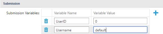
Clicking on the button on the right side of the table grid
will create an empty row in the Submission Variables table.
The ‘Variable Name’ is the name of the submission variable referred to by the Business Rules and the Data Map. The ‘Variable Value’ is the default value for the submission variable.
Clicking on the button to the left of any corresponding row
in the Submission Variables table will remove the corresponding
Submission Variable from the App.
Remember to save your changes by clicking the button in
the action bar before leaving the General Information page to ensure
that you do not lose your changes.
Creating and Editing Pages
Pages are the content of your App. They are what a user will see when they view your App as a submission. Pages can be static (such as a simple one-page form) or they can be very dynamic (a multi-page form that hides or shows items depending on what the user is doing). How you make your Page is up to you, and ReachLite’s flexible tools allow you to customize your Page to great extent.
In order to start adding Pages to an App, the App’s name and description must be specified and saved successfully.
Creating a New Page
To create a new Page, click on . The Page editor module will
appear to allow you to start making your Page:

Copying an Existing Page

To avoid the hassle of recreating a Page, use the  button to
replicate the selected Page.
button to
replicate the selected Page.
Editing a Page
There are many parts to a Page that you may edit, and a lot of functionality that you can control.
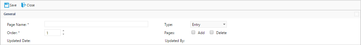
General Information
You can edit various general properties of the App here. Navigate on General tab
If you make a new App, start by filling out this information first.
Make sure to click before leaving the General
Information page to save your input.
General:
Page Name (Required): The name of the Page
Type: There are two types of Pages: Entry and Info.
- An ‘Entry’ type Page is generally one that has some sort of user input during the submission process.
- ‘Info’ is generally a read-only Page.
Note that these types are simply visual separators in the App tree view and choosing either will not affect the Page at all. A form designated ‘Info’ can still have user input. The types are simply there to help you separate your Pages within an App.
Order: The order in which the Page will be viewed in relation to all of the others in the App (when a submission of the App is being made).
Pages: Set permission to add or delete pages. A new page would be an instance of the Page that does not have any user input.
Updated By/Date: When and by whom the App was last updated.
Cascading Style Sheet (CSS):
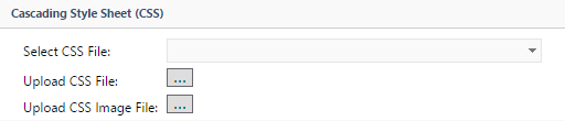
- Upload CSS File: Click on Browse button to select a CSS File and create a name for it:
- Click ‘Select’ to browse for the CSS file on your computer. You can then use the dropdown box to select one CSS file to use for the Page.
- CSS Image File: Click on Browse button to select CSS Image Files
- Default – Allows you to select from the default images that are available on the server by default.
- Upload – Allows you to upload your own image from your computer.
Once you update a Page for the first time, it will appear under ‘Page’ in the tree view on the left side of the screen.
App Converter
The App Converter allows you to import a file in Adobe PDF or an image format and add it to your Page as the background image.
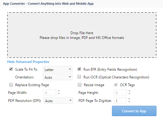
1. Select the file you want to convert by dropping the file into the drop field (indicated by the ‘Drop File Here’ text) from your computer’s filesystem.
2. Scale To Fit To: Select this checkbox if you want the image to take on dimensions that will fit a selected page size (Letter, Legal or A4 format as currently supported). Note that Page Width and Page Height fields will be disable in this case. To enable these fields, uncheck the ‘Scale To Fit To’ checkbox.
3. Orientation: Use this dropdown menu to set the document orientation to either portrait or landscape mode. The orientation is set to portrait mode by default.
4. Run EFR (Entry Fields Recognition): Select this checkbox to run EFR on the uploaded file. This feature is described in the next section.
5. Run OCR (Optical Characters Recognition): Select this checkbox to run OCR on the uploaded file.
6. Replace Existing Page: Select this checkbox if you want to replace the existing page’s background image and ALL of its controls with the uploaded file. If the checkbox is not selected, then the controls will remain but the background will change to the uploaded file.
7. Resize Image: Select this checkbox if you want to manually resize the image. The Page Width and Page Height fields will be used if this option is enabled.
8. PDF Resolution (DPI): If you are uploading a PDF file, you may choose a specified DPI resolution or you may set it to auto and the best resolution for the file will be chosen.
9. PDF Page to Digitize: If you are uploading a PDF file which contains multiple pages, you may choose a specified page number to be included is a Page to your App.
Entry Fields Recognition (EFR)
EFR is a feature that allows for recognition of entry controls in an image or a PDF file. This includes controls such as text boxes and checkboxes. If you select for EFR to run, it should not take too long (about 5-10 seconds), but could get a little slower if the file is very large.
EFR will do its best to find as many of the fields in the file, and add those controls to the Page. For instance, if it finds a text box in the image file, it will overlay a textbox control to the field’s content in that same location with the right size dimensions.
Although EFR is quite accurate in most scenarios, it will not always be completely correct in its placement of controls. Problems may come up in instances where the image or PDF is of low resolution, or if there are stray marks on the original hard copy of the form when it was scanned in. This may result in controls be put in the wrong place, extra controls being added, or some not showing up. In any case, fixing the form is easy and can be done in the Content section of the Page, described in a later section. There are usually very minimum adjustments that have to be done, and overall it is much faster than having to add the controls manually from scratch.
Content
The Content section allows you to edit the content of your Page by adding various dynamic controls that will shape your Page into what you want it to be. Click on the ‘Content’ Tab in the Page editor to enter the Content editor.

If you uploaded an image or PDF file in the ‘General’ tab for a Page, then it will be displayed here, allowing you to add controls on top of it.
The Content Toolbar allows you to add controls to the Page and format/align them properly.
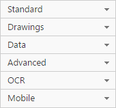
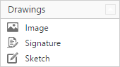
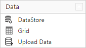
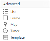
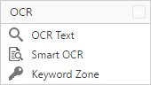
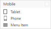
The sidebar controls are divided into four dropdown subgroups; Standard Controls, Drawing Controls, Data Controls, Advanced Controls, OCR Controls and Mobile controls.
Adding Controls
The first dropdown of the toolbar allows you to add various controls to the Page:
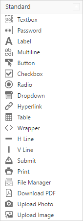
You can mouse over the icons to find out their respective functions.
Mobile Controls
Once a mobile frame is inserted onto the App, you may use the mobile portion of the toolbar to customize your mobile layout. This section of the toolbar may only be used when a tablet or phone frame is dragged onto your App.
Clicking on the  icon will open up the Mobile Wizard, allowing
you to access the layout and skin manager.
icon will open up the Mobile Wizard, allowing
you to access the layout and skin manager.
Mobile Frames
Adding a mobile frame to your App is as simple as adding any other control, by dragging the feature onto your App.
NOTE: Your Page must be empty all controls before adding a mobile frame.
Once you drag a mobile frame onto your App, you will be prompted by a ‘Skin Manager’ window:
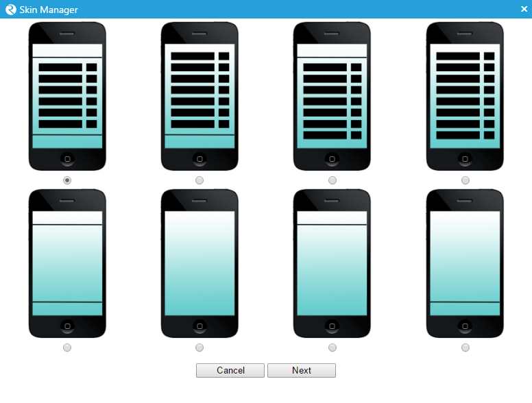
First, you must choose a layout for the mobile device. Upon clicking next, you will be prompted by the skin selection screen:
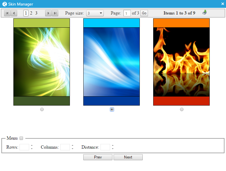
Here you can select a skin for your mobile frame (from the multitude of available options). You also are given the ability to generate a menu with options including:
- Type: Header or Footer
- Rows: Number of rows in the menu
- Columns: Number of columns in the menu
- Distance: Specify the distance between menu icons
- Position: Menu location (top/middle/bottom)
Control Manipulation
Using the alignment and selection tools, you can manipulate how controls are aligned on the Page.
 +
+ 
Copy/Paste/Delete Controls
Use this part of the toolbar:  to copy, paste, and delete
controls and images.
to copy, paste, and delete
controls and images.
Note that control can by copied by using Ctrl+C / Ctrl+V combination or Ctrl+C / Mouse Click on the App.
Text Formatting
Use this part of the toolbar:  to format text on the Page.
This allows you to bold, underline, italicize, and align left, centre,
or right.
to format text on the Page.
This allows you to bold, underline, italicize, and align left, centre,
or right.
Designer Grid
Click the  button to toggle the Designer Grid. This shows a
grid on the background of the Page that allows you to more easily
manipulate the placement of your controls while you are designing your
Page.
button to toggle the Designer Grid. This shows a
grid on the background of the Page that allows you to more easily
manipulate the placement of your controls while you are designing your
Page.
Control Properties
On the bottom right-hand side of the Page editor is the control properties dialog box. This is a dynamic dialog box which changes to allow you to edit the properties of any control in a Page.
Select any control in Content page to view and edit its properties.
General Properties
The General Properties of a control deals with its behaviour and size / position on the Page.
The General Properties heading is marked by the  icon. There
are some properties which every control has, no matter what type it is.
These are the following:
icon. There
are some properties which every control has, no matter what type it is.
These are the following:
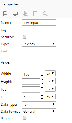
| Property Name | Property Description |
|---|---|
| Name | The name of the control and what it is referred to. No spaces or special characters are allowed in this field. |
| Tag | A user defined description of the control. |
| Secured | If checked, the security tab becomes active and allows you to set control permissions for other users. |
| Hint | A user defined tooltip hint for the control, appears when mouse cursor is hovering above the control. |
| Width | The horizontal size of the control. |
| Height | The vertical size of the control. |
| Top | The coordinate for the top of the control. |
| Left | The coordinate for the left of the control. |
| Required | If checked, the specified field will require user input before the App can be submitted. |
| Category | The data category to which this belongs to. |
| Element | The data element with which this control is associated with. |
Other properties that may appear specifically on some controls include:
Checkboxes
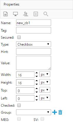
- Type: The type of the control element. Relevant types include Checkbox and Radio.
- Checked: Whether or not the checkbox is checked when it is initially viewed.
- Group (Check Group): Select a group that you want to assign a checkbox or radio button or both types to. A group of checkboxes is primarily used for reasons such as un-checking some checkboxes if one is already checked, used in conjunction with MEG.
- MEG (Mutually Exclusive Group): Sets the selected Check Group as a Mutually Exclusive Group. When enabled, controls under the selected Check Group become mutually exclusive.
- SV (Single Value): Determines whether or not the checked value(s) of a Check Group should map to a single value stored inside a database. Returns the first checked control of the group or the first control of the group if no controls are checked.
To create a Check Group, click on the  button beside the group
list. Enter the group name and click
button beside the group
list. Enter the group name and click  .
.
To delete a group, select it from the list and click on the
button.
NOTE: Check groups made in one Page are available in all Page of an App.
Text Boxes / Multiline Text Areas
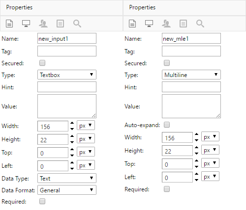
Type: The type of the control element. Can be used to switch between Textbox and Multiline control types.
- Value: The default text value for this text field. Left blank by default.
- Auto-expand (Multiline Only): When enabled, automatically expands text area vertically when creating new lines exceeding the height of the text area.
- Data Type (Text Box Only): Determines the input type used for text formatting purposes. Types include Text (default), Number, and Date.
- Data Format (Text Box Only): Determines the format of the input
field based on the Data Type selected:
- Text: Email, General (free text), Phone number (10-digit North American phone number), SSN (9-digit Social Security Number)
- Number: Two digit, Four digit, Decimal place formatting, Currency formatting
- Date: Varying date formats including [d/m/yyyy], [dd/m/yyyy], [dd/mm/yyyy], [mm/dd/yyyy], [yyyy-mm-dd]
Image Box
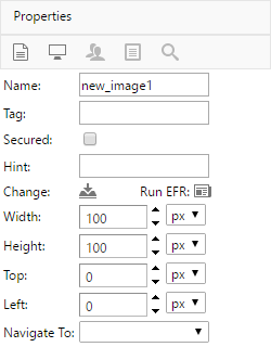
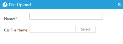
Change: Allows you to change the image that is being displayed in the image box. Pick an uploaded image or select from the default images.
To upload an image, click the  button. Set a name for the
image and click “Select” to browse for an image. The image will then
upload. Please wait for a success message.
button. Set a name for the
image and click “Select” to browse for an image. The image will then
upload. Please wait for a success message.
You are also able to run Entry Fields Recognition (EFR) on the
image. Click the  button to run EFR.
See the section on EFR to learn more.
Data Grid
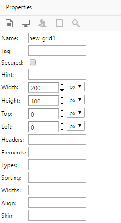
- Headers: Header of each column in the grid. Separate by commas for each column.
- Elements: The name of the elements coming from the data source (coming from the data category). Separate by commas for each column.
- Types: Types.
- Sorting: Sorting.
- Widths: Column Widths. Separate by commas for each column. Use the asterisk symbol ‘*’ to fill/occupy the remaining the space for the last column.
- Align: Align.
- Skin: Skin.
Table
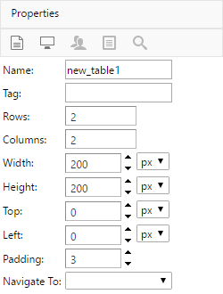
- Rows: Number of rows in the table.
- Columns: Number of columns in the table.
- Padding: The amount of padding space surrounding each cell.
Hyperlink
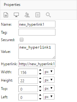
- Value: The link text associated with the Hyperlink URL.
- Hyperlink: The destination URL address to where the link redirects the user.
Map
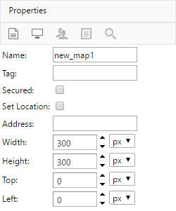
- Set Location: Sets the map’s location to the user’s current location.
- Address: The user can input a location’s address that the map will centre itself on.
Note: Enter a specific, valid address in order for this feature to operate properly.
Display Properties
The display properties have to deal with various display features of the
control as it appears on the Page. This Display Properties tab is marked
by the  icon. These include:
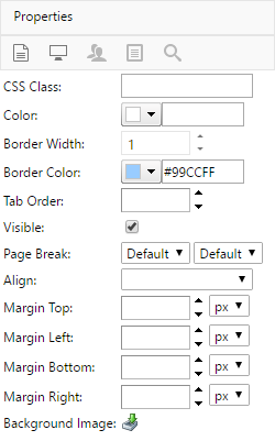
| Property Name | Property Description |
|---|---|
| CSS Class | The CSS class which depicts how the control will look like and behave. |
| Color | The color of the control’s body (i.e. background color). |
| Border Width | The width of the control’s border. |
| Border Color | The color of the border. |
| Tab Order | The order in which the control will be selected when the user pressed the “Tab” key. |
| Prevent Overflow | If checked, prevents the control’s contents from overflowing from its control area. |
| Text Limit | The maximum length or characters allowed in the text value field. |
| Tab to Next | If checked, pressing “Tab” on the control will focus the next control elements specified in the tab order. |
| Disabled | If checked, users will not be able to interact with the control. |
| Readonly | If checked, control value will not be editable in submitted Apps. |
| Visible | The control element will only be visible if checked. |
| Align | The horizontal alignment of the control’s content (i.e. text alignment). |
| Margin | The horizontal and vertical margins of the control. Can be set in pixels or percentage. |
Security Properties
If you checked the ‘Secured’ checkbox on the General properties page,
then the Security Tab will appear. Clicking on this tab will allow you
to change the permissions that various users or groups or users (roles)
have for that control when a submission of the App is created. This tab
is marked by the  icon.
icon.
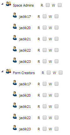
For each user or group of users, select whether they can Read/See (R) or Write/Edit (W) the control in a submission. Selecting a permission for an entire group (role) gives that permission for all users within it, regardless of whether they are in a different group that has not been given that permission.
Dropdown Properties
Dropdown Properties apply exclusively to Dropdown control elements,
which defines the available selectable options of a Dropdown menu. The
properties view is accessible by clicking on the  icon under
the properties panel when a Dropdown control is selected.
icon under
the properties panel when a Dropdown control is selected.
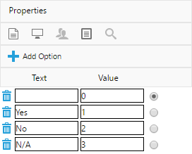
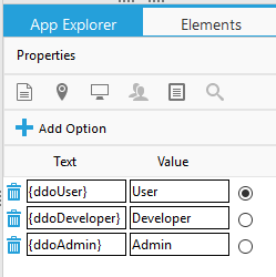
Each option comes with a Text field and a Value field. The Text field is used to store a user defined string, which is visible to all in the Dropdown menu. The Value field stores a hidden variable associated with the selected option, which can be used for internal and statistical purposes.
To set the default dropdown item, select the radio button to the right of the dropdown item to make it default. If no default dropdown item is specified, the first (topmost) dropdown item will be designated as the default.
To add an option to the Dropdown list, click on the Add Option button.
To remove an option from the Dropdown list, click on the icon
to the left of the option that you wish to remove.
OCR Data Elements
The OCR Data Elements properties panel applies exclusively to the Keyword Zone control, which is used in conjunction with the Smart OCR component in ReachLite.
Keyword Zones are typically used in ReachLite to assist Smart OCR in determining the coordinates of OCR control fields with high accuracy. The properties panel allows the user to associate OCR field names with controls within a close relative proximity. These controls are referred to as Data Elements in this section, and can be configured from this panel.
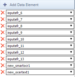
To add a field to the Data Element list, click on the Add Data Element button, which will create a new Data Element dropdown menu in the Data Element list. Then, select the designated control field from the newly created dropdown menu that you wish to associate the Keyword Zone with.
To remove an existing Data Element, click on the icon to the
left of the Data Element that you wish to remove.
Business Rules
The Business Rules section of the Page editor is used to create and assign various operating rules on controls of your App. Click on the ‘Business Rules’ tab in the Page editor to enter the Business Rules Module:

Business Rules are useful when attempting to create a dynamic and interactive environment in your various Apps. You can define how your App (and its many controls) behaves under certain conditions and allow events to be triggered when a user performs a specific action in a submission.
Adding a Business Rule
To add a business rule to a Page, click on  . This will open
the Business Rule editor:
. This will open
the Business Rule editor:
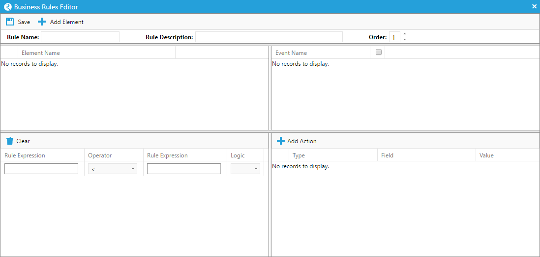
Here you will be able to create a rule using various elements of a Page, such as the controls that were added in the content page.
You can specify a name for your rule, as well as a description at the top.
The ‘Order’ of the rule is the order in which the rule will be executed in sequence with other rules within a submission.
Click  periodically to avoid losing any changes you make
to a Business Rule.
periodically to avoid losing any changes you make
to a Business Rule.
Adding an Element to a Business Rule
To add an element to a business rule, click 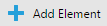 .
.
This will initialize a record of that element in the top left table.
Use the dropdown menu to find the control in the Page onto which you would like to add a rule. If you want the rule to affect the entire submission, select ‘SUBMISSION’ from the dropdown menu. Note that if you select ‘SUBMISSION’, it can be the only element in the rule.
To delete an element from the table, click the button
beside the element in the table,
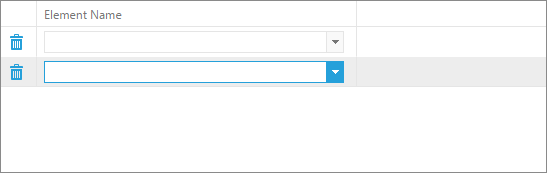
Specifying an Event
When you create a new rule element and specify its control, a list of events will appear in the top right section of the table. These are all of the events that can possibly occur on the control you selected on the top left-hand side of the window. You can select an event by clicking on a checkbox beside it. If an event is selected, then when that event occurs within a submission, actions that you specify will occur (if all conditions on the bottom left section hold true).
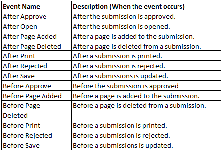
Remove “After Page Deleted” and “Before Page Added”
Add “After Page Activated”, “After Page Inactivated”, “After Session Time Out” and “Before Open”
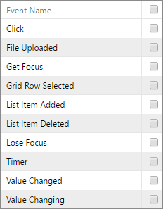
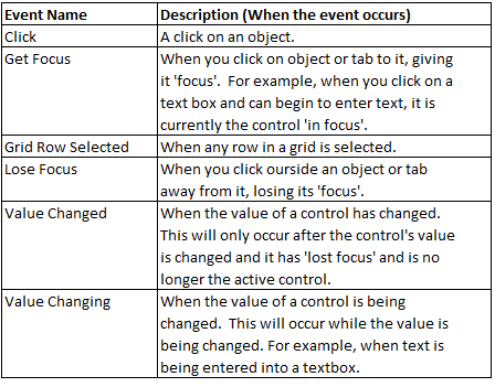
Events that can happen on controls are the following:
Certain Events can also occur on the entire submission. All the events labelled ‘After’ occur once the event has happened. All the events labelled ‘Before’ occur after the appropriate button to trigger the event has been clicked, but before the action actually occurs. This will allow actions to take place after the event is requested but before it actually occurs.
Rule Conditions
In some instances, you may want actions to occur only if there are certain arguments that hold true. This is what the Rule Conditions are for. Rule Conditions can be set up on the bottom left side of the Business Rules editor.
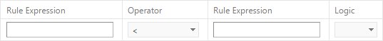
To create a condition, you must create two expressions, and then select an operator that will be used to compare them. You may then use logical operators (AND/OR) to combine all conditions into one statement.
Creating Rule Conditions
To create/edit an expression within a condition, click on one of the two expression boxes. This will open up the “Rule Expression Builder”:
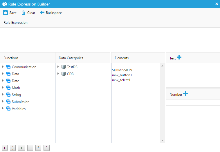
The expression that you build will be in the big white space under ‘Rule Expression’. You can build the expression using built-in functions, the submission itself, controls on the submission, text, numbers, and operators.
The toolbar at the top has three buttons. Click  to save
your rule expression. Click
to save
your rule expression. Click  to clear the expression
completely. Click
to clear the expression
completely. Click  to remove one character from the
expression.
to remove one character from the
expression.
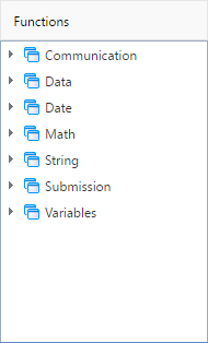
Functions
There are many functions that can be used to return expression values. They are located under the ‘Functions’ heading in the expression builder. To add a function, double click on the function. This will open the “Set Function Parameters “window, in which you can set the parameters of the function:
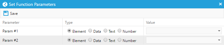
To select the parameters, first indicate the type on the left (element
by default), and then enter or select the desired parameter on the
right. Click to save your choices.
Functions are divided into 7 categories. These are:
The following is a list of functions that can be used to build your expression.
| Function name | Function Category | Description | Parameters |
| LDAPLOGIN | Communication | Active Directory Login |
|
| SENDEMAIL | Communication | Sends an email to the recipient email address |
|
| SENDSMS | Communication | Sends an sms message to the recipient number |
|
| DELETEDATA | Data | Executes the delete action of the specified data category |
|
| FILTERDS | Data | Filters the data in a table based on a certain value in a column from the table. The data is not deleted, but the table is made smaller by the filter. The filtered table can be unfiltered using the function REMOVEFILTERDS. |
|
| GETCURRENTDC | Data | Return data based on the data category of the control in the first parameter. All other parameters are optional and can be used to further define which data to obtain and return. | 1. A Control on the page 2+. Additional Parameters |
| GETCURRENTDE | Data | Return the current data element of a certain control in the Page. In addition, if the second parameter is ‘Y’, it will try to convert the data to the type specified in the control’s data element field found in the control’s properties, and will leave it if it cannot be converted. IF the parameter as ‘N’, the data type will not be changed |
|
| GETDATA | Data | Executes the select action of the specified data category |
|
| GETDSVALUE | Data | Returns data from a particular table in a datastore at a particular location in the table |
|
| GETPDFDATA | Data | Returns a pdf of the page as a base 64 string | N/A |
| INSERTDATA | Data | Executes the insert action of the specified data category |
|
| REMOVEFILTERDS | Data | Removes all filters from the table in the datastore. |
|
| SETCURRENTDC | Data | Updates a datasource with data from a datastore using the other parameters in the function which tell it where to update the datasource. Return 1 if it is successful, or 0 or an error if not successful. | 1. Datastore 2+. Additional Parameters |
| SETDATA | Data | Executes the update action of the specified data category |
|
| AGE | Date | Returns the time between two dates in the specified format |
|
| DATE | Date | Converts text into date format. The text is formatted into the format of the second parameter |
|
| DAY | Date | Returns the day of the date passed to it |
|
| MONTH | Date | Returns the month of the date passed to it |
|
| NOW | Date | Returns the current date and time | N/A |
| YEAR | Date | Returns the year of the date passed to it |
|
| ABS | Math | Returns the absolute value of the value |
|
| FLOOR | Math | Returns the greatest integer that is less than the specified real number |
|
| LOG | Math | Returns the base e logarithm of the value |
|
| LOG10 | Math | Returns the base 10 logarithm of the value |
|
| MAX | Math | Compares two numbers and returns the largest one |
|
| MIN | Math | Compares two numbers and returns the smallest one |
|
| NUMBER | Math | Returns a number representation of text |
|
| POW | Math | Raises one number (the base) to the exponent of another |
|
| ROUND | Math | Returns a rounded value based on the set number of decimal places |
|
| SQRT | Math | Returns the square root of the value |
|
| DECRYPT | String | Decrypts previously encrypted text and returns the decrypted value |
|
| ENCRYPT | String | Encrypts text using the MD5 one-way hashing algorithm and returns the encrypted value |
|
| LEN | String | Returns the length of specified text |
|
| POPUPHELP | String | Creates a popup help window with user defined text |
|
| REPLACE | String | Replaces X with Y in a control field |
|
| TEXT | String | Creates a string type variable |
|
| ADDLISTITEM | Submission | Adds an item to an existing list |
|
| ADDTABROW | Submission | Inserts a row into a table control. You can specify which row and what control you want to insert under that row |
|
| CHKGRPCNT | Submission | The first parameter is the name of a check group. Return how many check boxes are checked in the check group if the second parameter is ?Y’. Return how many check boxes are unchecked in the check group if the second parameters is ?N’ |
|
| COPYLISTITEM | Submission | Copies an item from a selected list |
|
| DELETELISTITEM | Submission | Deletes a selected item from a specified list |
|
| DELTABROW | Submission | Deletes a row from a table control |
|
| EVAL | Submission | Executes the JavaScript code specified in the parameter |
|
| GETGRIDITEM | Submission | Return data from a specified grid at a specified row and column |
|
| GETLISTITEMDATA | Submission | Returns the data of previously specified value stored in the submission’s memory. The value can be assigned using the SETLISTITEMDATA function |
|
| GETPROPERTY | Submission | Gets Element Property Value by Name |
|
| GETURLPARAMETER | Submission | Obtains the name and value of the URL |
|
| GETVALUE | Submission | Returns the value of a control |
|
| GUID | Submission | Generates GUIDs | N/A |
| INVOKERULE | Submission | Invokes one Rule from Another |
|
| OPENWINDOW | Submission | Opens a new browser window with a specified area |
|
| SETGRIDITEM | Submission | Assign the value of a specific row and column on a grid |
|
| SETLISTITEM | Submission | Assign the value of a specific item in a list |
|
| SETLISTITEMDATA | Submission | Assigns a value for specific data in a list to be stored in the submission’s memory. This can then be retrieved using the GETLISTITEMDATA function |
|
| SETPROPERTY | Submission | Sets a property of the control to the specified value |
|
| GETSUBVAR | Variable | Returns the value of a previously created variable in the submission’s memory (created using the SETSUBVAR function) |
|
| SETSUBVAR | Variable | Creates a new variable with the specified name and value and places it in the submission’s memory. This variable can later be used in different places in the submission. The variable can be retrieved using the GETSUBVAR function |
|
Actions
Once an active event for an element has occurred and all conditional expressions have evaluated to true, any actions that are listed on the bottom right will occur in the submission. The following is a list of actions that you can set to occur.
To add an action, click  .
.
A new action will be listed in the actions section. You must select a type for the action. These are listed and described in the table below. Some may require the ‘field’ and/or ‘value’ columns, while some will not require either. The ‘Field’ column allows you to choose a control in the Page, or the entire Page (SUBMISSION), while the value column allows you to create an expression using the expression builder (same as the one described earlier for rule conditions).
Send Notification
Send notification to users by email. Click on the “Edit Mail” expression to open the Compose Email frame below:
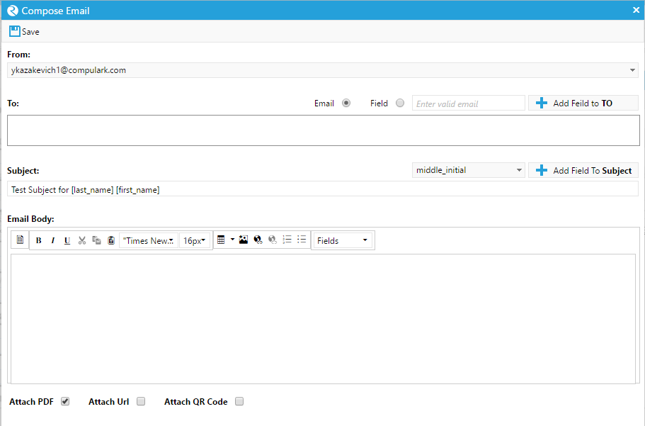
The compose email frame is divided into 5 sections
From: Select the email from dropdown. The list of emails from the dropdown is populated from your space.
To: Input the recipient email address or select/import fields from your template by selecing “Add Field to TO” dropdown button.
Subject: Input the email subject or select/import fields from your template by selecting “Add Field to Subject” dropdown button.
Email Body: Input the email body or select/import fields from your template by selecting from the “Fields” dropdown button.
- Attachments:
Attach PDF: Attach PDF version of the app to the email.
Attach Url: Attach the app’s url to the email.
Attach QR Code: Attach the app’s QR Code to the email.
| Action | Description |
| Alert Message | Displays an alert message with the value specified. (No field necessary) |
| Bind Controls | Binds specific field data to the DataStore |
| Change Submission | Adds or removes field values that have been updated. (Specific to certain functions) |
| Clear Drawing | Clears a drawn portion of a control that supports drawing. (No value necessary) |
| Clear Data | Clear Entire Submission |
| Check Required | Checks whether or not the required field has been filled with the necessary data. |
| Confirm Messages | If a confirm message action occurs, a message will appear in the submission confirming a certain action to occur as defined by the name of the actions (add, delete, etc.) If the action is ‘confirm message’, a generic confirm message will appear when the action is triggered. |
| Add | |
| Close | |
| Delete | |
| Message | |
| Open | |
| Save | |
| Copy | Copies a specified field or entire page to a specified location. |
| Page Field From | |
| Page Field To | |
| Page From | |
| Page To | |
| Data Load Mode | Preloads Data before Submissionsi opened |
| Download PDF | Downloads the page as a PDF through browser |
| Download PDF Data | Downloads the page as a PDF as a base 64 string and places it in the control |
| Last Version | Gets the value of the control as it was on the last submission of the Page. |
| Load Grid | Loads the grid specified in the value box (use the CURRENTDC function in the expression builder) into a grid control defined in the field column. |
| Load on Demand | Loads the specified field upon the user’s request |
| Load Select | Takes a data table specified in the value column and loads the items from the first two columns of the table onto the ‘select’ object (dropdown box) in the field column. The first column in the data table is used as the ‘value’ for the dropdown option (each row is an option) while the second column in the row will be the display item (what is seen as the option). |
| Make Control Disable | Makes the control in the field column disabled (no value column) |
| Make Control Enable | Makes the control in the field column enabled (no value column) |
| Make Control Invisible | Makes the control in the field column invisible (no value column) |
| Make Control Not Required | Makes the control in the field column not required for submission (no value column) |
| Make Control Required | Makes the control in the field column required for the submission to be completed (no value column) |
| Make Control Visible | Makes the control in the field column visible (no field value column) |
| Make Page Visible | Make a page in the submission value visible |
| Make Page Invisible | Make a page in the submission value invisible |
| Move To Page | Change the current visible page of the submission. Enter the page number in the value box. |
| Open File Manager | Opens File Manager |
| Popup Dialog | Opens a popup dialog with a user defined message. |
| Print Submission | Opens the printer dialog to print the submission (no field or value column) |
| Redirect To Webpage | Redirects the user to a webpage as defined in the value box. |
| Run Field OCR | Performs an OCR action on a control element. |
| Run Javascript | Executes Javascript Code Snippet |
| Run Smart OCR | Performs a Smart OCR action on the current App. |
| Run XFA script | Executes XFA Code Snippet |
| Save Submission | Save the submission (equivalent of pressing the ‘save’ button). In the value box, indicate ‘Y’ to show a message box indicating the save was successful, or ‘N’ to not show this message box. |
| Scroll Up | Scrolls up to the top of the page (no field value required) |
| Set Submission Variable | Field input becomes labelled as a variable which can be retrieved throughout the entire App. You can define the variable in the ‘value’ box. |
| Send Notification | Sends a notification to the user by email or sms. (use the Edit Mail function in the expression builder) |
| Set Current Location | (For maps) Sets the location of the map to the user’s current location. |
| Set Location | Sets Map locations |
| Set Height | Set the height of the control in the field column to the value in the value box. |
| Set Left | Set the left position of the control in the field column to the value in the value box. |
| Set Time Interval | Sets length of the timer in milliseconds |
| Set Top | Set the top position of the control in the field column to the value in the value box. |
| Set Width | Set the width of the control in the field column to the value in the value box. |
| Set Value | Set the value of the control in the value field to the value in the value box. |
| Start Eraser | Change the cursor to an eraser tool to erase drawings on controls that support drawing. |
| Start Pencil | Change the cursor to a pencil tool to draw on controls that support drawing. |
| Start Timer | Starts the timer |
| Stop Timer | Stops the timer |
| Upload Data File | Triggers upload action of the File Upload Control |
| Upload Image | Allow the user to take an image and attach it to the app. |
| Upload Photo | Allow the user to upload a photo from his/her computer. |
Data Mapping
Data Mapping is the process of creating Data Element mappings between a user’s Data Sources and the Controls of a Page, and enables the user to retrieve and update information shared between Data Sources/Elements and ReachLite’s Control fields with ease.

To open the Data Mapping Editor, first open the target Page under the
‘Pages’ tree of the App Explorer, then click on the  button
located in the action bar.
button
located in the action bar.
Data Mapping Editor
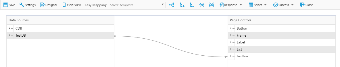
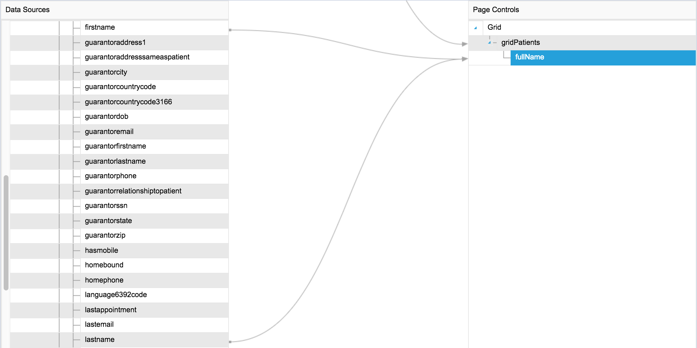
The editor frame is divided into three distinct sections (displayed from left to right, by default):
- Data Sources Tree: A tree view consisting of all Data Sources tied to the user’s Space. All Data Elements are grouped by their respective Data Categories, and Data Categories are grouped by their respective Data Sources under the top node.
- Mapping Canvas: Located in the center, the Mapping Canvas is a display canvas depicting the mappings between the Data Sources and the Page Controls. Unidirectional arrows are used to indicate the mappings, one for each mapping.
- Page Controls Tree: A tree view consisting of all the Page Controls that are currently situated on the selected Page. All controls are grouped by their respective types under the top node.
Editor Toolbar

The Editor Toolbar is located at the top of the editor as illustrated above. Listed below are the descriptions of the toolbar items:
- General: Returns to the General Settings page of the Page without saving.
- Designer: Returns to the Designer page of the Page without saving.
- Save: Saves all changes and applies the current Data Map.
- Expand All: Expands all parent nodes of the tree views.
- Collapse All: Collapses all parent nodes of the tree views.
- Unmap: Removes the data mapping associated with the selected node.
- Unmap All: Removes all visible data mappings from the current view.
- Request/Response: Toggles the direction of mapping for the Data Map.
- Select/Update/Delete/Insert: Toggles the data object command of the Data Map.
- Success/Fail: Special data processing in case of successful and failed requests.
- Close: Closes the Data Map editor and returns to the previous page without saving.
Direction of Mapping
ReachLite’s Data Mapping Editor supports two directions of mapping:
- Response: Inbound Mapping describes the mapping and retrieval of information from a Data Category/Data Source to a Page Control.
- Request: Outbound Mapping describes the mapping and binding of information from a Page Control to a Data Category/Data Source.
By default, Response mode is selected upon opening the editor. You may switch to either Response or Request view at any time via the Inbound/Outbound dropdown item from the Editor Toolbar.
Note: Note that the layout ordering of the trees will change upon switching the direction of mapping between Response and Request modes.
When Response mode is specified, the Data Source Tree appears on the left side, while the Page Controls Tree appears on the right side.
When Request mode is specified, the Page Controls tree appears on the left side, while the Data Source Tree appears on the right side.
Using the Editor
In order to use the Data Mapping Editor, you must have already created a Data Source, a Data Category, and a valid Request/Response schema for the Data Category of your choice.
Ensure that you have created a number of Page Controls on your App Page for use in Data Mapping.
Once these prerequisites are met, you should see that both Data Source and Page Controls trees be populated.
Data Sources Tree
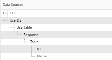
The Data Sources Tree contains the set of all Data Sources, Data Categories, and Data Elements defined in the current Space.
Each Data Source node contains the set of all associated Data Categories, where each Data Category node contains the associated Schema, which provides information such as the Header, the Response/Request data structure, and Data Elements in subsequent sub trees (as illustrated above).
From the bottom of the Data Category hierarchy, it is possible to map the Data Element nodes directly to the appropriate Page Control nodes.
Page Controls Tree
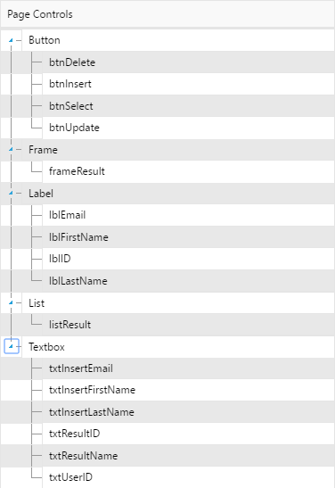
The Page Controls Tree contains the set of all Page Controls in the selected Page and the Submission Variables associated with the App.
Page Controls are categorized by control type and divided into sub trees (i.e. Button, Image, Textbox), and Submission Variables are listed under the ‘Variables’ sub tree.
Controls having complex properties such as Dropdown Controls and Tables which contain multiple attributes may be accessed through the control node’s own sub tree where applicable.
Creating a Data Mapping
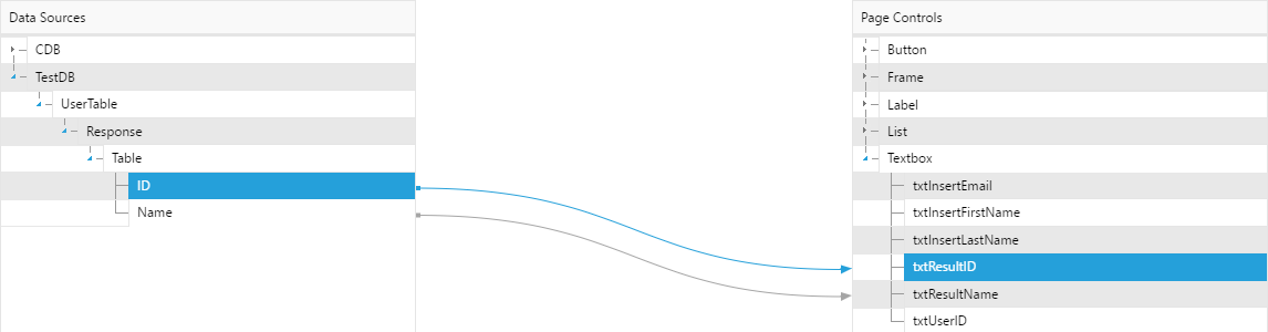
To create a data mapping, select and drag any of the source nodes from the tree on the left side and drop it onto the desired destination node from the tree on the right side.
For example:
- If you are creating a Response mapping, the source node must be a Page Element node and the destination node must be a Page Control node.
- Conversely, if you are creating a Request mapping, the source node must be a Page Control node and the destination node must be a Page Element node.
Once you have done this, an arrow connecting from the source node to the destination node should appear on the canvas to indicate a valid mapping.
In general, only Data Element nodes may be paired with Page Control nodes.
The only exception to this rule is the mapping from Data Category nodes to Data Store control nodes, such that Data Category nodes may only be mapped to Data Store Control nodes in order to store Data Category into the Data Store Control.
Removing a Data Mapping

To remove a data mapping, select the desired source node that is mapped
to another node (with a connecting arrow), then click on the ‘Unmap’
button  on the Editor Toolbar.
Alternatively, if you wish to remove all data mappings for the Page,
click on the ‘Unmap All’ button  the Editor Toolbar.
Data Expression Builder
We can map more than one element to a single page control in order to display multiple elements within the page control.
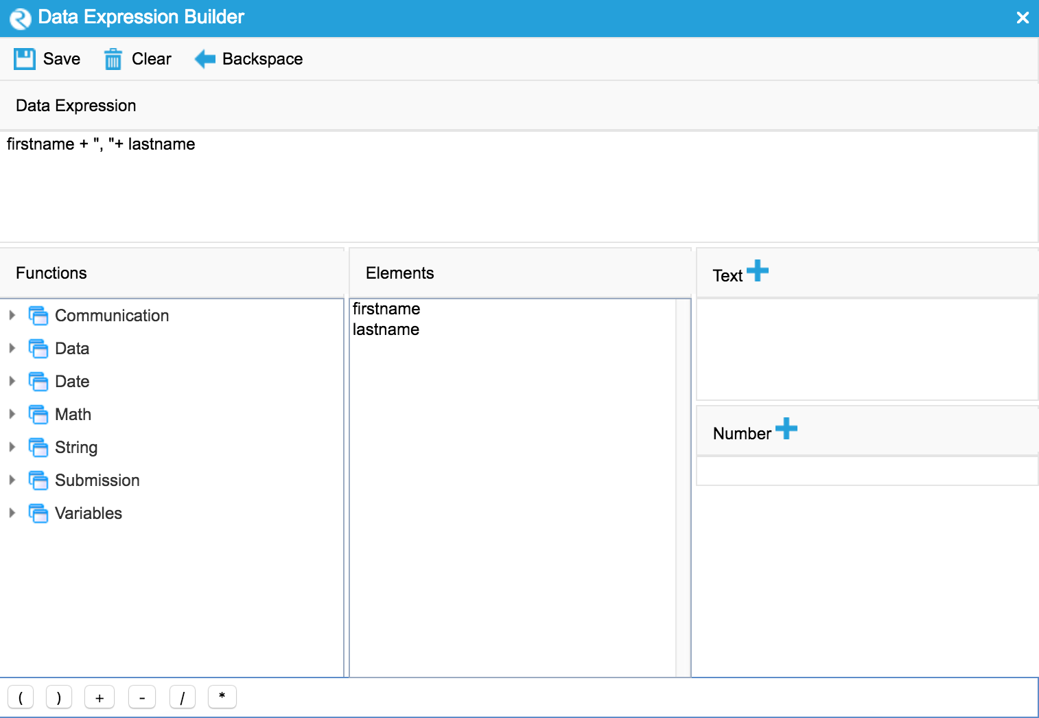
To display multiple elements within a single page control, we could launch the data expression builder by double-clicking on the page control.
Data expression allows you to customize the display of the elements within a control.
Translating Pages
Selecting the ‘translate’ button from the editor toolbar will bring you to the translate screen for the page. The translate page will allow you to enter translations for the labels on the page in one or more additional languages.
The translate screen is divided into two sections. Firstly, there is the Elements section which will list all the labels and other textual elements of your page with their identifiers on the left and their values on the right.
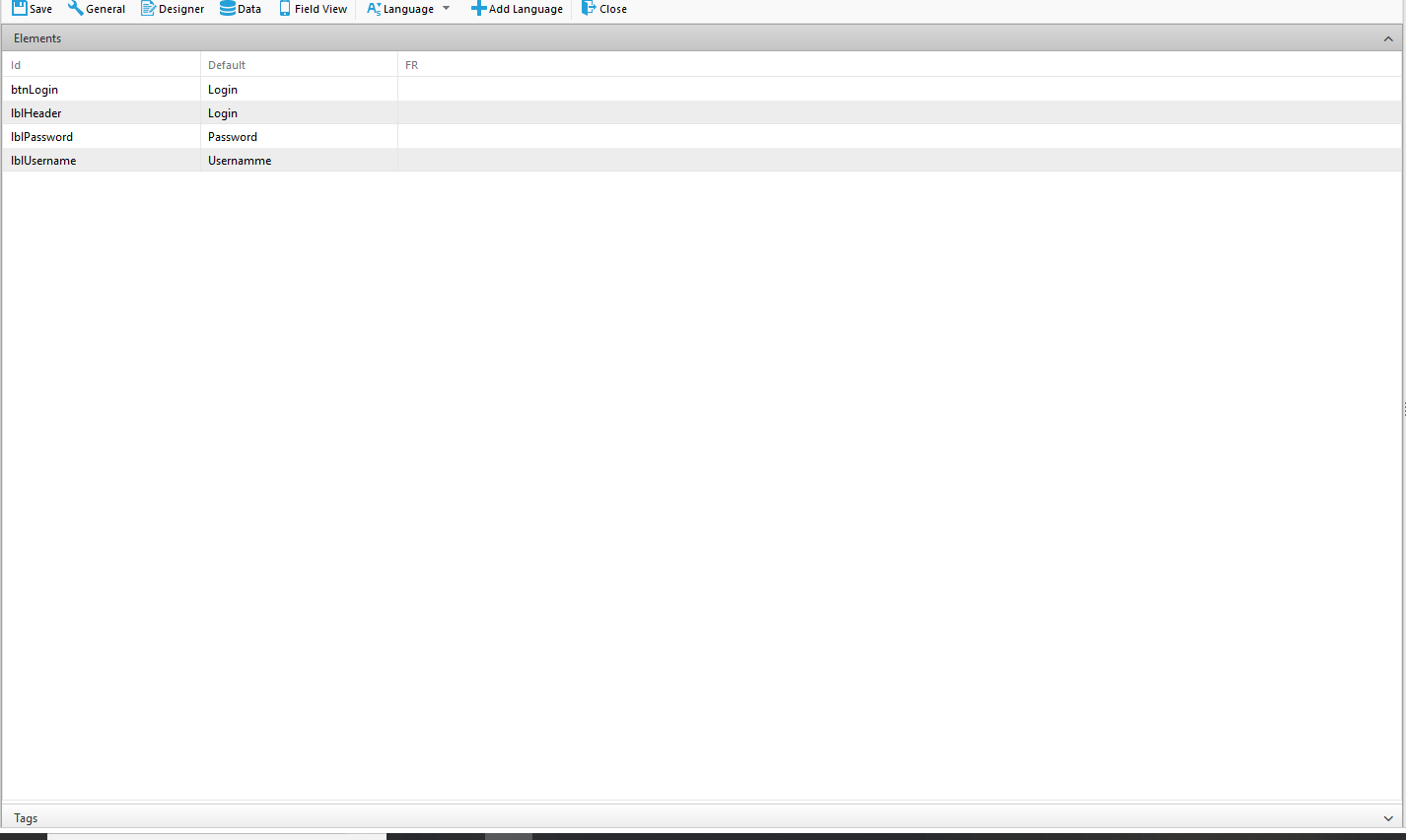
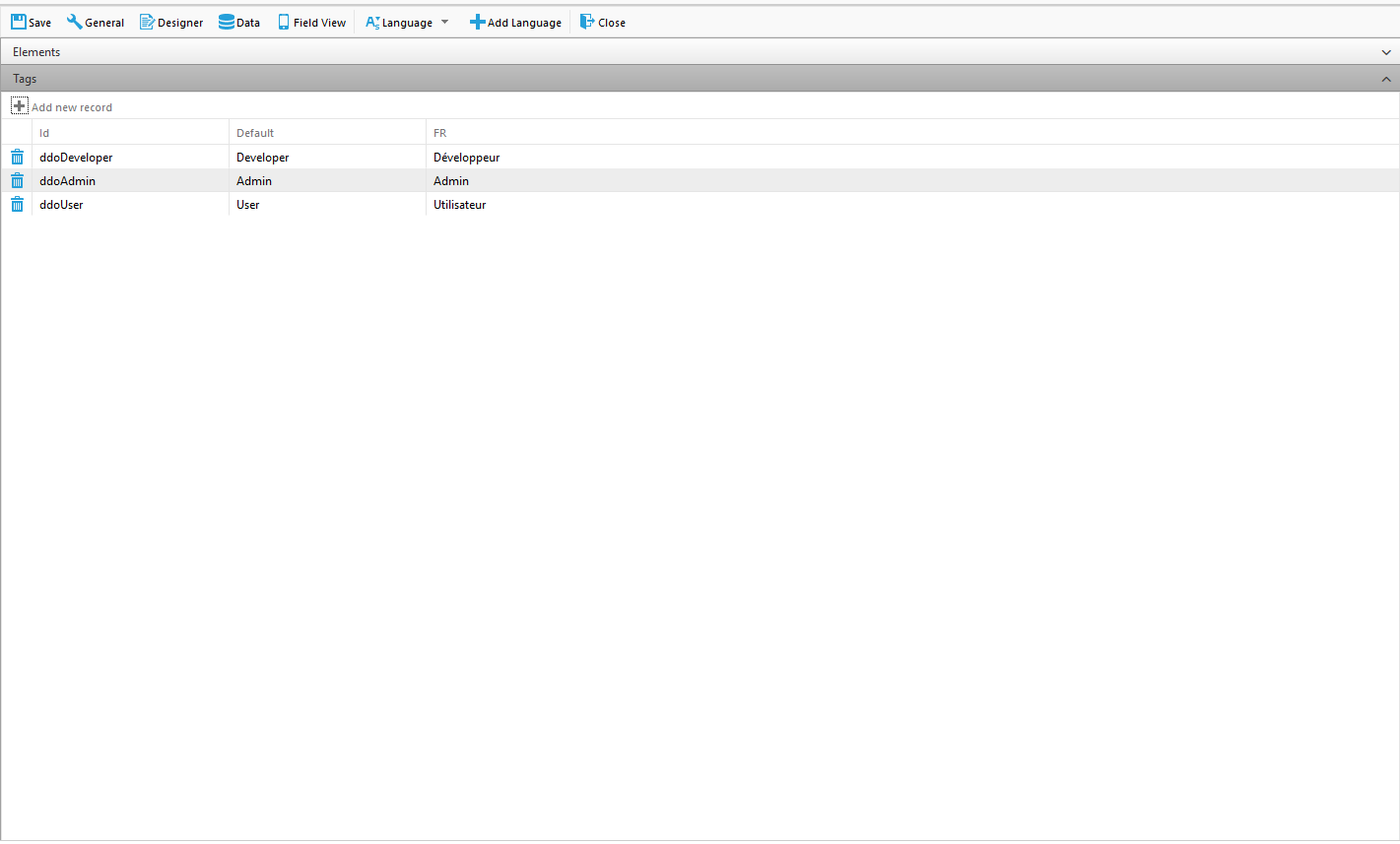
The second section is the Tag section which can be accessed by clicking on the Tag tab at the bottom of the Elements section. The tag section of a page will initially be blank as no tags are created automatically.
Adding a Language
Adding a language is a very simple process. First, click on the Language button in the editor toolbar which will open a dropdown list of languages. After selecting one of the listed languages simply click the adjacent Add Language button to add the language. Adding a language will create a new column in the table for the language.
Translating Elements
Once you have addded a new language adding translations for elements is a simple process of entering the translation into the textbox in the column of the added language. Once a translation has been added that text will be used in place of the default text when the browser is set to display that language.
Creating Tags
Tags are like placeholders for text that will be replaced when the app is run. They are useful for the more dynamic parts of pages such as dropdowns, messages, and business rules that can change as the user interacts with the page.
To create a Tag, open the Tag section by clicking the Tag tab at the bottom of the Elements section and click on ‘Add New Record’ at the top of the section. This will create a new row in the table where you can enter an identifier (id) and values for the default and any languages that you have added.
Using Tags on Your Page
In order to use the Tags you created all you have to do is replace the text that you want to be translated with the id of the Tag surrounded by {curly braces}. This will cause the text to be replaced with the text from the column corresponding to the browsers current display language or the default column if the current display langauge does not exist in the Tags table.
As an example, if you created a tag for a drop down with three options, you can create a tag for each option and insert the tag id as the dropdown options as shown.
App Categories
In order to organize your Apps, it can be useful to categorize them in a way that serves your needs. The ‘App Categories’ module allows you to set up a categorization scheme for your Apps which you can later use when you are creating and editing them.
Click on  on the main toolbar of ‘App and Data Management’
to open the ‘App Categories’ module.
on the main toolbar of ‘App and Data Management’
to open the ‘App Categories’ module.
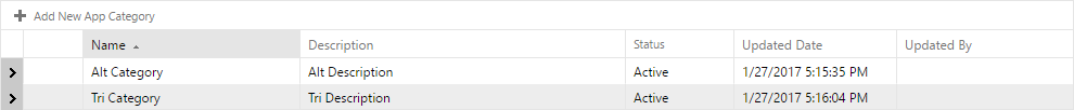
Adding/Editing a Category
To add a category to the list, click on the  button. You will
see a new category appear, allowing you to edit it:
button. You will
see a new category appear, allowing you to edit it:
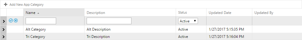
You can enter a name and a description for the Category, and you may select whether the Category is active and if it can be used when making your App Pages.
To save your changes to the Category, click  .
.
To discard your changes to a Category, click  .
.
If you want to edit an existing Category, click on the  button beside the Category name.
To delete a Category, click  .
.
Subcategories
Each main category that you create can also have subcategories associated with it for further organization of your Apps. A good example would be if you were working with medical forms that had to do with heart health, but you only wanted referral forms. The category could be ‘heart’ and the subcategory could be ‘referral forms’. This organization can be quite useful in many situations.
To add a subcategory, click on the  arrow on the left of the
category name you want to subcategorize. A new dialog box will appear
which is identical to the main category editor. You can add/edit
subcategories in a similar fashion to how you add/edit main
categories.
arrow on the left of the
category name you want to subcategorize. A new dialog box will appear
which is identical to the main category editor. You can add/edit
subcategories in a similar fashion to how you add/edit main
categories.
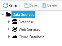
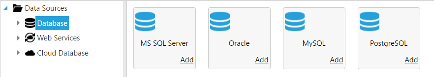
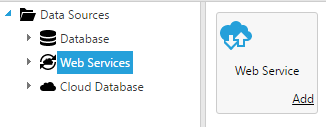
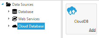
Data Sources
In order to obtain data for your created Apps and Pages and use them in submissions, you must define sources for your data to come from. Click on ‘Data Sources’ on the main toolbar of ‘App and Data Management’ to open the ‘Data Sources’ module.
This view will show a list of all of the data sources you are using. Three types of Data Sources exist: Database, Web Service, and Cloud Database.
Adding/Editing a Data Source
Select the type of data sources from the data sources tree.
This will bring up the list of properties of the data source:
This window allows you to edit various properties of the data source.
To edit an existing data source, click on the name under the data sources tree.
To delete a data source, click the  button.
NOTE: Always press the  button in the editor to save
your changes to a data source.
button in the editor to save
your changes to a data source.
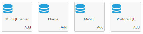
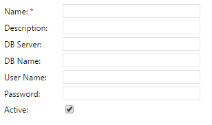
Database
Select the ‘Database’ option from the data sources tree view to have this data source obtain data from an external database/database server. There are a few properties you can edit for a database:
Database properties are as follows:
- Name: Call the data source anything you like.
- Description: A description of the data source.
- DB Server: The IP/domain address of the server.
- DB Name: Name of the database on the server you are accessing.
- User Name/Password: Credentials to log into the server.
- Active: Determines whether or not the data source is in use.
Web Service
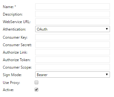
Web Service properties are as follows:
- Name: The name of the web service.
- Description: A description of the web service.
- Web Service URL: The URL that is used to connect to the Web Service.
- Authentication: Specifies the Authentication type (Basic or OAuth).
- Basic: Username and Password
- OAuth: OAuth is the standard for the Consumer authorization process.
- Consumer Key: User defined Consumer Key.
- Consumer Secret: Matching Consumer Secret.
- Request Token Link (OAuth 1.0 Only): Access Token Link.
- Authorize Link: Authorization Link.
- Authorize Token Link: Token for Authorization.
- Consumer Scope: Authorization Scope for this Consumer.
- Sign Mode: Signature mode for this Consumer. Options include: - Bearer - Parameter
- Use Proxy: Determines whether or not the Web Service should pass through a proxy.
- Active: Determines whether or not the data source is in use.
Cloud Database
The Cloud Database is an internal Cloud-based Data Source provided by ReachLite. The Cloud Database enables users without access to existing databases to create database linked Data Sources. Similar to regular databases, it is possible to define Data Categories and Data Elements for Cloud Databases.
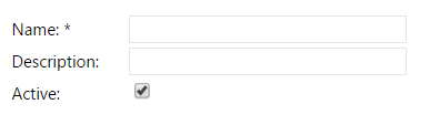
Cloud Database properties are as follows:
- Name: The name of the database.
- Description: A description of the database.
- Active: Determines whether or not the data source is in use.
As the Cloud Database is limited to the space user, login credentials are not required.
Importing/Exporting a Data Source
- Click on the ‘Export’ button
 to export data source file to your computer.
 - Click on the ‘Import’ button
 to import a data source file from your computer.
Data Categories
A Data Category is a way of organizing your data based on the information that you are obtaining from your data sources. You create a name for your category and then define how it obtains its information from a data source, and how it updates information back to a data source.
For example, let’s say you are working at a hospital. A Data Category that you might want to set up is ‘Patients’. Within that category you can then set up how it obtains information from a database that contains patient data. You can also create ‘Data Element’, for example ‘Patient Name’, ‘Date of Birth’, etc. You can also set up your very own cloud database to enter patient information directly in ReachLite.
You can then use Data Categories when building your Apps and Pages to get and update data to and from a data source, allowing for flexible data transfer that can really benefit your Apps.
Click on ‘Data Categories’ on the main toolbar of ‘App and Data Management’ to open the ‘Data Categories’ module.
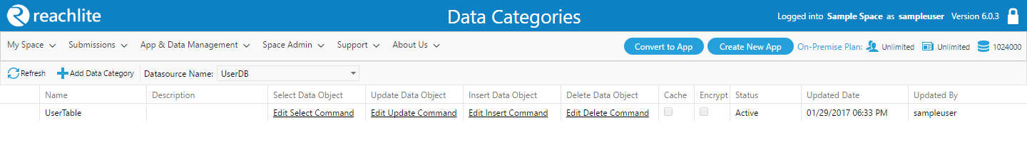
To see all the Data Categories for a particular Data Source, select the Data Source from the ‘Data source Name’ dropdown box.
Adding a Data Category
To add a Data Category, choose the Data Source in the dropdown box for
which you want to make the category for. Then click  . This
will create a new Data Category record in the list and place it in
Edit Mode:
. This
will create a new Data Category record in the list and place it in
Edit Mode:

In order to create a Data Category, you must specify the following properties:
- Name: A user defined name for the category.
- Description: A description of the category.
- Cache: Determines if the data retrieved from this Data Category should be cached.
- Encrypt: Determines if the data cached from this Data Category should be encrypted.
- Status: Active/Inactive. Indicates whether the category is to be used in App/Page creation.
Note: Once you have named and created your Data Category, you will no longer be able to rename the ‘Name’ attribute of the Data Category, so please be sure to name your Data Category wisely.
When you are done filling in the above fields, click on the
button to add the Data Category to the list, or click on the
button to discard your changes.
Once you have created your Data Category, it will be listed in the Data Category table among other Data Categories in alphabetical order:

The following section, Editing a Data Category, describes the steps for editing existing Data Categories, as well as the process for retrieving and updating data objects within Data Categories in detail.
Editing a Data Category
In order to Data Category’s basic properties (i.e. basic attributes and
flags), the Data Category must be placed under Edit Mode. Click on the
 button to enable Edit Mode for a Data Category:

The following properties are considered the basic properties of a Data Category, which may only be modified under Edit Mode:
- Description: A description of the category.
- Cache: Determines if the data retrieved from this Data Category can be cached.
- Encrypt: Determines if the data cached from this Data Category should be encrypted.
- Status: Active/Inactive. Indicates whether the category is to be used in App/Page creation.
When you are done editing in the above fields, click on the
button to save your changes, or click on the
button to discard your changes.
Note: As noted in the previous section, is it not possible to modify the ‘Name’ attribute once a Data Category has been created. If you wish to use a different name, you must create a new Data Category with the desired name.
Edits to Data Object manipulation commands are only possible outside of Edit Mode on existing Data Categories.
Data Object manipulation actions are explained in the following subsection, ‘Retrieving and Updating Data Objects’.
Retrieving and Updating Data Objects
In order to obtain (Select) information relevant to the data category from a data source, to edit (Update) the information on the data source, to add (Insert) new information into the data categories, or to invoke deletions (Delete) on data, Data Object Commands must be utilized.
The four types of Data Object Commands are Select, Update, Insert, and Delete.
These Data Object Commands can be edited by clicking on the Edit Select Command, Edit Update Command, Edit Insert Command, and Edit Delete Command button respectively. Doing so will open up the Command Editor window for the selected procedure.
Note that the interface of the Command Editor will vary depending on the Data Type of your Data Source as outlined below.
Database / Cloud Database
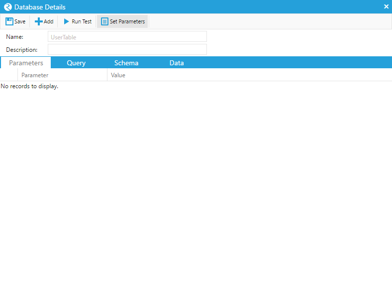
The Database Details window appears when editing the command of a Data Category associated with a Database/Cloud Database type Data Source. The Database Details window you to write SQL statements or select Database routines (stored procedures) from the Data Source.
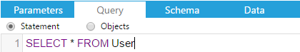
Writing SQL Statements
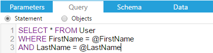
To issue SQL statements and queries directly to the SQL server, select the ‘Query’ tab, ensure that the ‘Statement’ radio button is checked, and insert the SQL statement directly into the text area below.
Using SQL Parameters
To use parameters in a SQL statement, parameters must be manually
created from the ‘Parameters’ tab, or generated from the SQL statement
via the  button.
To create a parameter manually, select the ‘Parameters’ tab, then click
on the  button to create an empty parameter field.
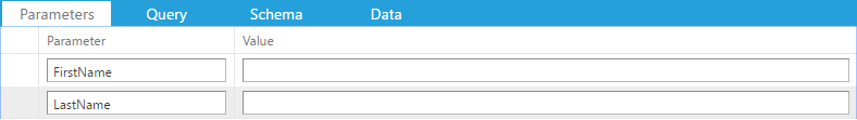
Alternatively, clicking on the button on the toolbar will
automatically populate the parameter fields from keywords in the SQL
statement with the ‘@’ prefix.
For example, clicking on the with the SQL statement entered
as illustrated below will create a new parameter field named “name”
under the ‘Parameters’ tab.
The added benefit of having parameters in your query means that they can be used for Data Mapping purposes, such as binding parameter fields with ReachLite’s controls in Data Mapped Apps.
Running Test / Schemas
In order to enable the binding of response data with ReachLite controls via Data Mapping, a Schema must be created for the response message, which is required for ReachLite to interpret the contents of the response in a well defined data structure.
The  button may be used to execute your SQL statement and
generate the Schema at any time, given that a valid SQL statement
was provided, where the SQL response will appear under the ‘Data’ tab.
button may be used to execute your SQL statement and
generate the Schema at any time, given that a valid SQL statement
was provided, where the SQL response will appear under the ‘Data’ tab.
Saving
Once you are done, remember to click on the  button to apply
your changes, or close the window to discard any changes.
button to apply
your changes, or close the window to discard any changes.
Web Services
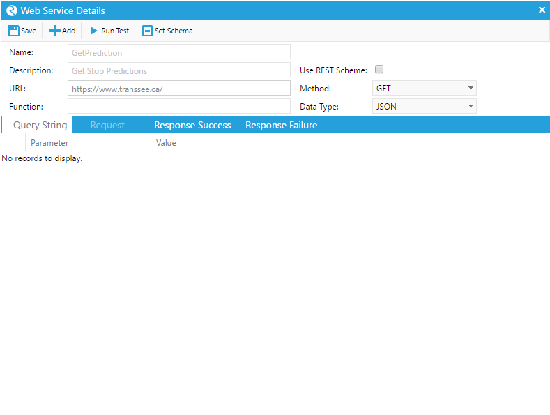
The Web Service Details window appears when editing the Command of a Data Category associated with a Web Service type Data Source.
The primary Web Service properties include:
- Function: The server side name of the Web Service function that is being called.
- Use REST Scheme: Determines whether to use REST scheme when calling the WS.
- Method: GET / POST / PUT / PATCH / DELETE. Web Service call method.
- Data Type: JSON / XML. Type of data returned by the Web Service function.
Editing Parameters
To add, modify, or remove parameters in the Query String, select the ‘Query String’ tab to access its list of parameters.
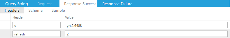
To add, modify, or remove parameters in the Request, Response Success, or Response Failure Headers, select the respective tab and click on the ‘Headers’ subheading to access its list of parameters.
To add a parameter, click on the  button located on the
toolbar.
button located on the
toolbar.
To remove a parameter, click on the button located in the
leftmost column of the desired row containing the parameter.
Running Test / Schemas
The button may be used to invoke the Web Service to provide a
sample response message to the Web Service Editor window.
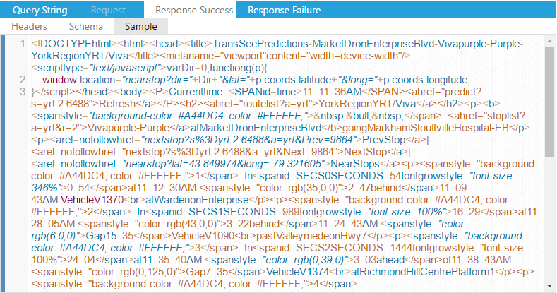
Upon a successful Web Service call, the appropriate responses from the server will appear under the ‘Sample’ subheading of the Response Success and Response Failure tabs.
In order to enable the binding of response data with ReachLite controls via Data Mapping, a Schema must be created for the response message, which is required for ReachLite to interpret the contents of the response in a well defined data structure.
Schemas may be generated by clicking the  button located
on the toolbar while the ‘Sample’ view is open, which will generate
a Schema for the displayed sample response.
button located
on the toolbar while the ‘Sample’ view is open, which will generate
a Schema for the displayed sample response.
After setting the Schema, the Schema data structure will appear under the ‘Schema’ subheading.
Saving
Once you are done, remember to click on the button to apply
your changes, or close the window to discard any changes.
Cloud Database
The Cloud Database component of ReachLite allows users to make use of database-based data sources without the need for external cloud data providers.
The Cloud Database interface can be found under the “App and Data Management” tab.
Creating a Table
In order to create a table, ensure that you have an existing Data Source configured for Cloud Database. If you have not yet set up a Cloud Database type Data Source, you must create one from the Data Sources interface. Section 4.8.2.3 describes how you can create a Cloud Database Data Source.

To create a table, first select the appropriate Data Source from the drop down list from the toolbar near the top that you wish to make changes to.
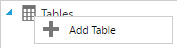
Then, on the left side of the panel, right click on the root node of the tree, labelled “Tables” with a leading folder icon. This will open up a context menu wherein you may select “Add Table” to create your table.
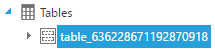
Once you have selected the “Add Table” option, a child node will be added under the “Tables” node. This node represents the table you have created, which will initially be given a randomized name.
Editing a Table
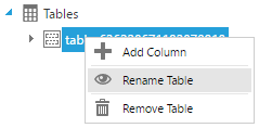
To rename a table, right click on the appropriate table node, then select the “Rename Table” option from the context menu. Use the editable text field on the node to rename the table, and press the enter key to confirm your changes.
Alternatively, you may rename a table by left clicking on the table node’s text after having selected the node.
To modify the table’s structure, such as columns and indexes, please see sections 4.11.4 and 4.11.5.
Removing a Table
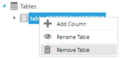
To remove a table, right click on the appropriate table node, then select the “Remove Table” option. A popup will ask for the confirmation for the removal. Clicking “OK” will remove the table permanently from the database, along with all of the table’s data. Otherwise, clicking “Cancel” will forfeit the removal process.
Managing Columns
To create a column, right clicking on the desired table node, then selecting the “Add Column” option from the context menu.
After performing this action, a new editable row will appear on the table inside the right pane of the window.
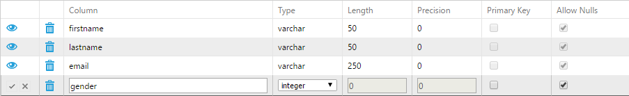
To edit an existing column, on the right pane, click on the  icon of the desired column. This will convert the row into an editable
row where changes can be made.
icon of the desired column. This will convert the row into an editable
row where changes can be made.
The column name can be set via the text box under the Column field, and its data type may be set via the drop down list appearing under the Type field.
The Length field denotes the maximum length of the data for non-fixed data types (used for numeric, varchar, and character data types), while the Precision field denotes the decimal precision for numeric values (numeric only).
The Primary Key checkbox determines whether or not the column represents a primary key.
The Allow Nulls checkbox determines whether or not data set to the column can hold a Null value.
Note: Columns with the Primary Key property checked will not allow the use of the Allow Nulls property.
To confirm your changes, click on the  icon in the first cell
of the selected row.
icon in the first cell
of the selected row.
To discard your changes, click on the  icon in the first cell
of the selected row.
icon in the first cell
of the selected row.
If you wish to remove a column entirely, click on the  button
for the desired column row.
button
for the desired column row.
Managing Indexes
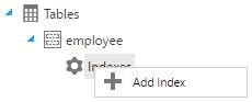
To create an index, expand on the desired table tree node on the left pane, then right click on the “Indexes” node and select “Add Index”.
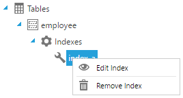
To edit an existing index, expand on the desired table tree node on the left and its “Indexes” child node, then right click on the desired index and select “Edit Index”.
Once the Add/Edit Index option has been selected, a popup window titled “Index Manager” will appear.
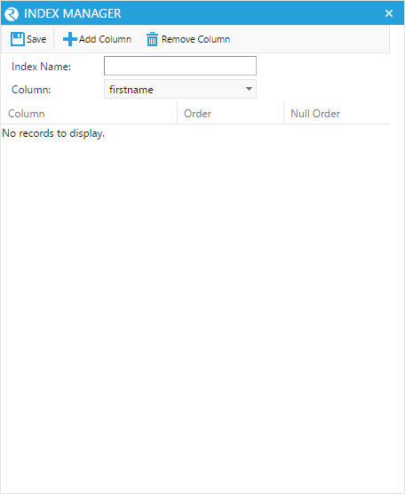
The Index Manager is an interface for setting the index columns and index properties of the selected table. Here, you can set the name, columns, and the orderings of the index.
The top half of the window consists of the toolbar, the “Index Name” field, and the “Column” drop down list, while the bottom half of the window consists of the index table, containing all columns associated with the index.
To add a column to the index, select the desired column from the “Column” drop down list, then click on the “Add Column” button in the window’s tool bar. Doing so will append a new row to the bottom of the index table.
To remove a column from the index, select the row bearing the column’s name from the index table, then click on the “Remove column” button in the window tool bar.
Each row in the index table may have its ordering set to either ASC (Ascending order) or DESC (Descending order), as well as Null ordering set to either FIRST (Null values appear first) or LAST (Null values appear last).
To save any changes, use the “Save” button in the window toolbar.
To discard any changes, simply close the window using the X button on the top-right corner of the window.
Note: While adding a column, if the chosen column already exists in the index table, no changes will be made to the table.